May/June - TCAF, Kamome Notes, Thoughts, Updates

Hi folks!

Oh wow, May has certainly been a crazy time. I thought April was quite insane, but most of early May I spent sick in my bed. No formal diagnosis, but something had infected my body, something non-contagious according to all the urgency care tests I took. My lymph nodes, which seem to really take some punches for me, were swollen on my neck and I was basically in a land of chills, body weakness, intense headaches, fever, and suppressed appetite for multiple days. Not COVID! Not any regular respiratory illness! So strange!

There was enough time between WWU Queercon and TCAF that I basically recovered the DAY of my flight to Toronto. I got extremely lucky, and didn’t have to rely on my cane. However, I did also learn I suffer from low blood sugar levels in the morning and HAVE to eat something or I will throw up… thanks red-eyed flights.


As most people know, I went to TCAF mainly to see if I could gamble my way to see Shirahama Kamome. During 2018, I went through a ton of hardships, which I made a zine about at the end of that year. It didn’t cover my suicidal ideation from my full-time contract job (animation for Netflix) and how I actually QUIT the job because of it. And how I left without any job waiting on my lap, no financial security or unemployment, and fell into a deep depression about my artwork and self-worth.
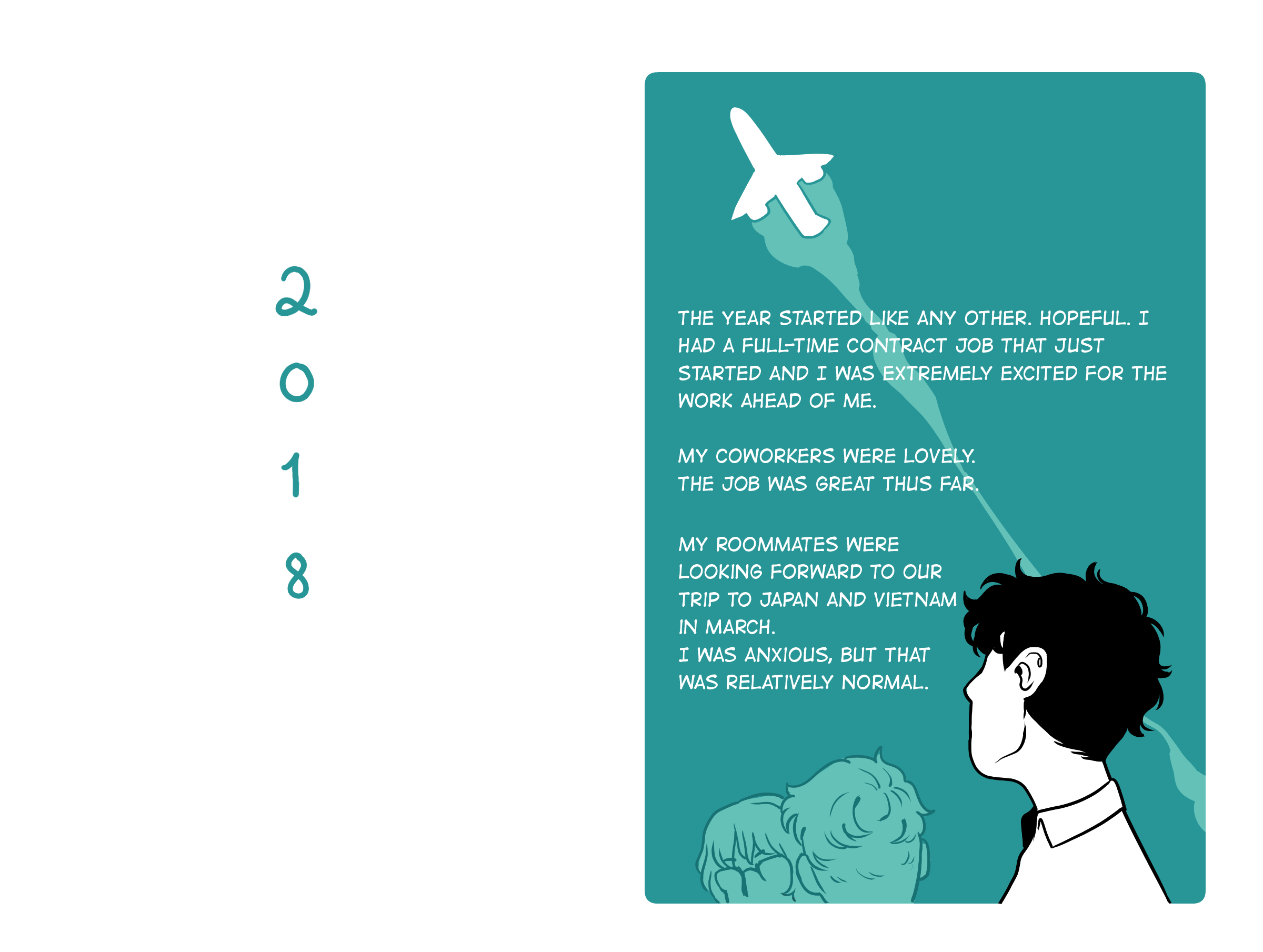
But it’s fun to see that when I went to Japan for the first time with my roommates, I was introduced to Kamome’s work. Witch Hat Atelier just released its second volume, and it was uncertain if it was coming to America. I was desperate for more; I wept, looking at how amazing the art was and how incredibly thoughtful the storytelling was (thank you, scanlators). I kept talking about it on social media for what seemed like screaming.

I returned to Japan later that year, and she held a gallery at the GoFa (Gallery of Fantastic Art) in Shibuya. I was so lucky my trip lined up with it because it was after I had left my animation job and really needed a pick-me-up. It changed my brain chemistry FOREVER. For those wanting a glimpse at the gallery and interested in my particular eye for what I’m looking for while scouring originals… here’s the link:

To say I’m “just a fan” feels like a lie. Kamome’s work gave me a lot of hope in being a full-time cartoonist and that things that I enjoy can be loved by many others as well. When it was announced that it was being translated into English, I’m sure someone remembers that I would religiously ask everyone to preorder their copy and announce when the next volume would be released. It was my “chainsaw man” posting before chainsaw man.

Pre-orders really do matter! It really shows the publisher the interests of their fans and how many of their books they need to be producing! I’ve seen the numbers, and I’ve heard the numbers of copies of books being cut to prioritize other books!!! It’s real! So, thank you to those who picked up a copy and continue to make the book thrive. LOL I’m so happy that it’s successful and continues to be garnering more fans. Just wait until the anime comes out, then there will be EVEN MORE!


There was so so much that happened at TCAF that recapping would be insane. Summary, people were crazy and rude on Saturday, but I got lucky and my pal Zach Clemente, publisher of Bulgilhan Press, offered me his tickets to see her talk on Sunday. On top of that, I won a ticket to get something signed by her and say something to her. It was… really! everything I could have asked for from the trip. I’m grateful for everyone in my life that allowed for this to happen.

So here’s a link to my notes I took at the Sunday talk, and a copy of the notes someone else took at the Saturday panel.

Sunday:

https://docs.google.com/document/d/1X_fPv6BTc_pqDNwn2CUtr3SduoaEO6GbhFH6Ump6_QY/

Saturday:

https://docs.google.com/document/d/1gythZxcM-at1KOhJlP6vBpku3zPCcg_6t-mXlX1xQBQ/edit

Being a person with social anxiety, I’m glad I got to meet some people and had some folks invite me to hang out with them. I’m so so grateful.

Thank you to Nur, Kyla, Aria, Juby, Blue, Kay, Zach, Ari for being there and keeping me company. It truly made my week.


JAPAN

It’s!!! happening! June 9th, I take off. I’ll be on Instagram and Tiktok, and I will be updating there with photos and other junk! On top of that, I’m closing on my house soon! Everything is crazy! I’m stressed! I’m so grateful for this opportunity, but now I gotta pack! BOTH MY LUGGAGE AND HOUSE. AHHHHHH.

I have updated the downloads with a new artwork PSD to pick through! Feel free to take a look!

OH ALSO ALSO I will be making a NEW 5.5x8.5 Template soon! I have one that works well with MIXAM, and need to put together a little zip file. More to come.

My Voice [New Comic]

Hi folks!

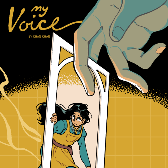
It’s here! My new short comic. My Voice.

If you read my previous blog post, this comic was made for Shortbox Comics Fair! It’s a digital only fair where you can buy a bunch of NEW comics by 100 artists.

I had set this comic as Pay What You Want, but due to time constraints, the person running the fair could not figure out how to get Squarespace to allow for tiered pay. Because of those issues, I’ve asked them to set it to be available for FREE!

You can either download the comic directly from the fair, or on my blog, which I’ll have a link at the bottom of this post. That or you can go to the downloadables page.


I was sort of expecting this comic to breeze by folks, but it was nice to see people react to it. I have such a difficult job finding any value in my voice, because my peers have such incredible ideas, art, and simply excel at everything!!! I honestly don’t know what I can say that hasn’t been said before, if not better. This comic is just a peek into what my friends have to tell me every day!

I hope you all enjoy it! New updates to come!

Download it at Shortbox Comics Fair!

or

September Updates! BSC #12 is out, conventions, new comic!

Hello folks!

September is almost coming to an end and I have finally had a chance to update! I have lots of things to catch you up on, so this might be a big big post. I’ll have things separated out into sections of interest.

Conventions

Emerald City Comic Con has passed back in August, and I’m grateful for everyone who had came by and given me their kind words about my work. I think my biggest highlights were talking shop with lots of artists at different stages of their careers, along with people mentioning that they’ve read my War for Rayuba comic! Will I be at ECCC next year? Probably, since it’s local. Is a 4 day convention becoming too long for this old millennial (according to some young folk I sat next to on an airplane)? Yes…

Boise Comic Arts Festival had just happened too! It’s a lovely festival based in Boise, Idaho and I loved being there. I was a special guest along side some amazing artists, and I will say, I’ve never been treated so well at a festival in my life! It has a lot of growing pains, but I think it has a special spark. Josh Shapel, the event coordinator, did so well and I will highly recommend getting in touch with him if you are ever interested in attending it someday. Especially if you love to talk to librarians and educators, there’s a lot of need for more progressive voices out there!

I’ll be at MICE this October and will be walking around SHORTRUN in November!

The Baby-sitters Club #12 Released

I am happy to announce that BSC 12: Jessi’s Secret Language is out in stores! It actually came out on September 6th, and I’ve been on the road and doing lots of things since then. But as of this post, there’s some crazy news about it.

  • Debuts at #4 on Indie Best Seller Children’s Interest list

  • Debuts at #25 on USA Today Best Seller list

  • Debuts at #1 on Publisher’s Weekly Children’s Frontlist Fiction

What does this all mean? For a book that just came out, these numbers are quite fantastic. It shows the power of the BSC IP is really strong, and Scholastic’s power in the MG category of Graphic Novels. If you look at the Units Sold on any sort of reporting article, even on PW, those are BookScan numbers that only cover retail sales. This doesn’t include libraries or other wholesale school related sales, which are significant numbers to how books do! Hopefully this information is an interesting look at the publishing industry, it’s more crazy complicated than this.

ShortBox Fair

ShortBox is almost upon us! It’s an ONLINE fair dedicated to releasing all new comics by 100 creators. I was fortunate that they would have me. I created this comic sort of on a whim, and it will be available for PAY WHAT YOU WANT starting October 1st. That’s right, my comics are free, again! I personally have such a hard time believing anyone would want to pay money for my work, so I always put it up for tips only.

This is a high resolution preview, so feel free to take a closer look if you so choose.

Some of you might relate it to SoftLead, and while I’ve been afraid of that, I also have come to realize that at this time… I really only have so much I can and WANT to say lately. So I hope that it resonates with any of you, even if it’s generally the same message but slightly nuanced in a different direction.

Poster Giveaway Incoming

I did a really fun poster for an incredible nonprofit recently. I don’t know why they thought I would be a good fit at all, but the editor and art director was so kind and patient while I was flailing around relentlessly! I am honored that Molly, my agent, encouraged me to get this done. Here’s a secret preview for you all!

The nonprofit will give me a few copies to give away. I’ll post the full piece here when it’s revealed and folks here can request one from me when I do!

That’s all I have for now! I have updated my downloadables last month, so there’s a few new things. But I hope I can release more stuff soon. Maybe I’ll talk about making stickers sometime soon!

Where do I print books?

Hi Folks!

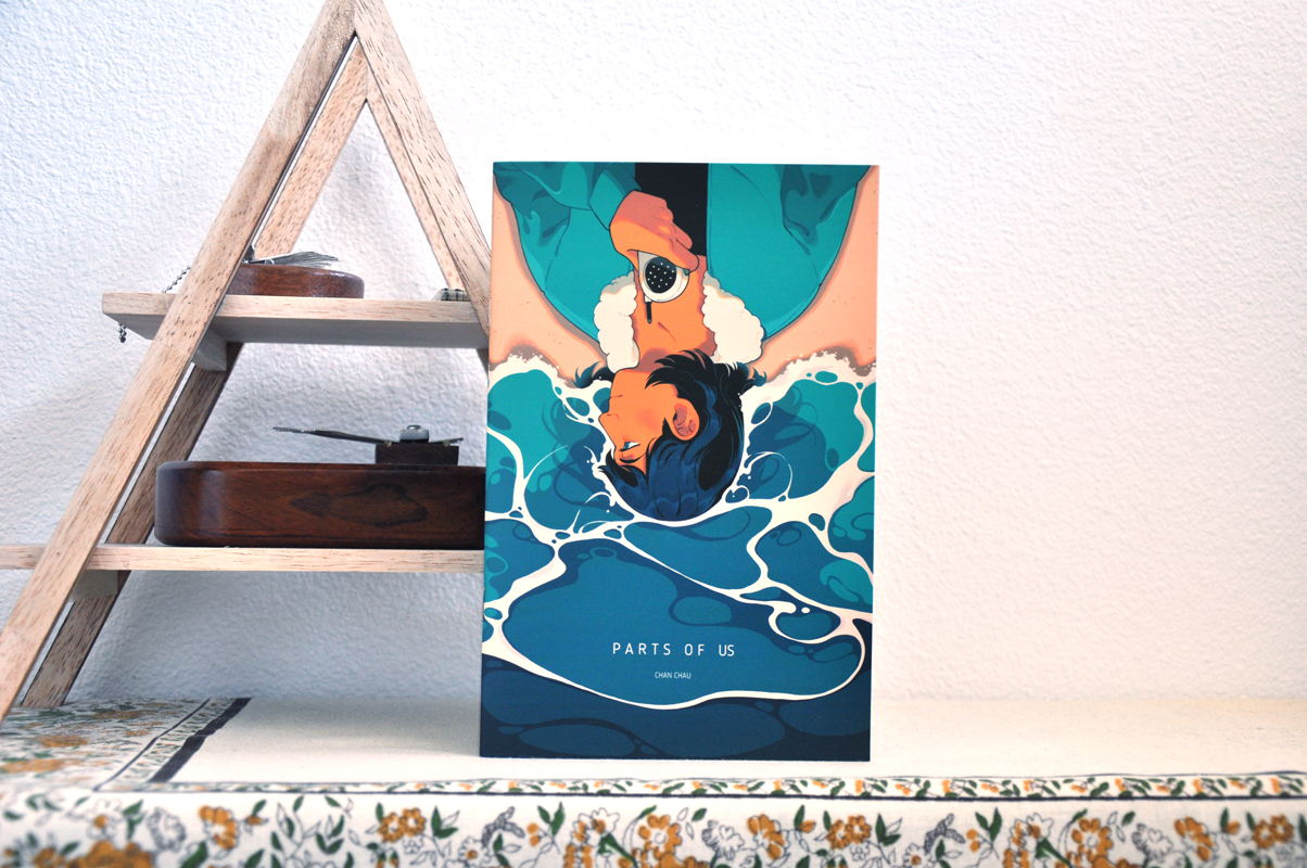
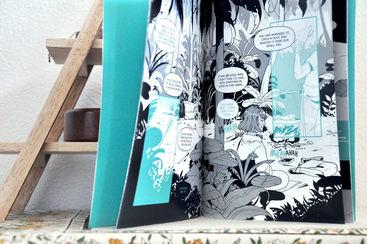
My book “Parts of Us” is here! I finally got the chance to take some silly photos. I used my old Nikon d90 for this, like all of merchandising photography, and did some quick gentle color balancing to fix some of the colors. But I’m stunned! The blues came out so vibrant, which I did not expect with a digital printer. Maybe technology and paper has been getting better, or maybe I never use very bright colors in my work! (The latter is very true.)

Parts of Us book sitting on a table
Interior shot of the Parts of Us book

Printing!

This is my third time printing through this company, and I’m happy with the quality again! They’re on top of things in terms of making books, and they provide a nice low quantity for independent artists.

The company is called MIXAM and they have locations in the UK and in the US from my knowledge. They have a great turn around time, and amazing paper stock options. Things to note however: I have a decent library of printing knowledge and have experience with printing books. So I typically have a good time with any printer, but I think MIXAM excels at having a print on demand calculator which includes shipping estimates. This way, people can figure out what days they have to turn in their files in order for them to get their books on time for a convention or an online store. (This is called Lead Time.)

I do use my comics template when I print through them, however I also use Photoshop for Prepress and InDesign for Page Layout.

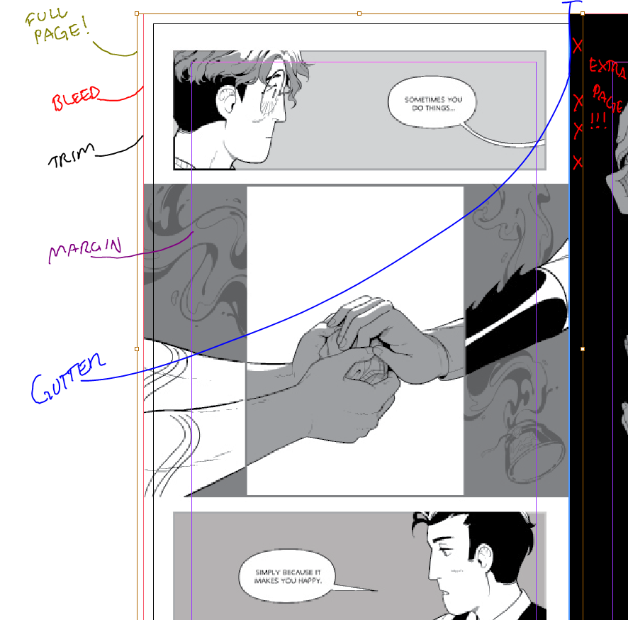
This is the technical part of the blog: For those of you wondering, printing is the main reason why I tell folks to be cautious with my template. It is a slightly bigger size than your typical 8.5x5.5” format, which gives some wiggle room, but can lead to some extra drawing that wont show up if you don’t pay attention. I think the template has an issue with calculating gutter space.

Here’s an example of a page in InDesign.

The brownish boarder indicates the full page size, and you can see it extending slightly past the bleed on the left, but extends into the other page pretty far.

It’s because the way the inDesign document is formatted doesn’t account for gutter bleed. Which is so tricky and depends on the individual printer if they include it or not.

But I’m still in the process of tinkering with this template, and it’s all very very technical!

TLDR: Be careful toward the edges of the comic template if you ever use it! Or you might regret it!

Thanks for reading!

Parts of Us is getting Printed and Life Update!

Hi folks!

A little blog update about how things have been going! Thank you to everyone who has subscribed so far, I hope you have been enjoying the gentle updates this month. I’m still figuring out new tutorial material for the next month, but I have been making some artwork while the month of July has been chugging along.

Here are the UPDATES!

There is a new, tiny timelapse in the downloads section! Check that out!

Parts of Us is getting a print run! It’s been so long, but I’ve finally had a chance to set up my book for self publishing. It’s crazy to think that a few years have already passed since I made this short for ELEMENTS: EARTH, and I had already forgotten how to draw the main character, Aviva. I haven’t colored in what feels like a long time, so this was a great exercise to get back into it.

These are just some process pictures (which you can kind of see how my previous tutorial influences my covers too), hope you enjoy!

Glad that square space allows a slideshow view, because it’s awesome to see how a piece progresses without having to upload a timelapse! Yeehaw!


Other than this, I am going to be working on some new stickers soon and a SECRET PROJECT! This secret project will take up some of my time the next few months on top of doing this blog and other odd jobs, but if everything works out, it could be life changing for me. I hope you all will cheer me on if it ever works out. I’ll also see if I can work with my client to allow you all to get first looks and exclusive updates!

How I tone my comics - Composition and Balance

Hi folks,


Following up on the last post, this post is more specifically geared toward how I balance my pages in my comics. This kind of thinking can also be applied to illustration work as well, but the examples I have below are pieces from my most recent comic pages, because I feel that my comics require a little more complexity in flow and legibility than my single illustrations needs to convey.

What am I looking at?

My brain! Sort of! When working on a page, I always imagine my work in large blocks of black and white, and then after, I add tones to further push the composition and give areas some additional clarity. This preplanning allows me to not worry so much about balancing my pages toward the finishing stages.

So what kind of large blocks of black and white do I think of? Well, these are some of the basic shapes I find myself drawn to!

As you can see, each box has a different focus, and it’s not necessarily based on lighting. It’s more about the silhouette and composition. Here are some quick sketches that utilize some of these ideas.

One other important factor to my work is that I tend to allow characters and objects blend into the large blocks of black/tones. I don’t mind if details get cut out, and I avoid the “white halo” effect as much as possible. It’s a case by case basis, but it’s very lovely when you have a composition/silhouette built with the spot black in mind.

Practice

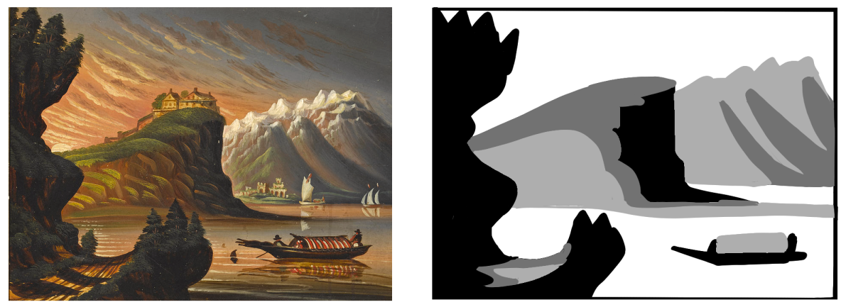
Here’s a little exercise that I used to do when I visited Museums frequently. I would take my pen and block out paintings very quickly in my sketchbook to capture their composition in black and white. It helped me figure out not only lighting of a piece, but reimagine the paintings in shapes.

The example piece below is by Thomas Chambers. I thought the artwork was stunning and had amazing shapes, so I wanted to break it down as fast as I could.

There isn’t much to say between each step that I hadn’t already explained, but I hope this helps you all think of your work in shapes! Try this out on your favorite artwork if you’re feeling stuck, or on a movie still that really captured your eye. Keep it simple and fast. Good luck!

How I tone my comics - It's complicated!

Hi folks!

Today, I’m going to cover how I generally do Black and White toning in my comics.

When I was participating in an Original Character Tournament ( abbreviated as OCT ), I had created a quick guide on how I process my tones. It was something to help folks get into comics, but it wasn’t a very comprehensive guide that covered the logic behind my choices. I wasn’t very happy with it, so it has now become this relic that people pass around between friends.

I finally set aside some time to edit this thing, hopefully it looks okay!

The logic between the steps are mostly for printing purposes. In printing, there’s a certain point where a printing past a specific darkness or lightness will end up being black or white. I’ve found that anything under 10% black and over 70% black makes negligible differences on how the printer sees those tones.

When I work, I always think of my art as a product to be printed, even if I don’t. But this kind of thinking gives me a safety net in case I decide to print it, and it allows me to imagine how my comics might look on different monitors. Because every screen is so different, someone with a cheaper monitor might not get to see the full range of tones and hues as other folks, and might make my work look dark or muddy. This is a small prevention measure for myself.

That’s cool, but how do I use this?

If you’re not worried about printing, you could just potentially just use the eyedropper on the provided tones. It will give you a direction on how you should tone your comics by limiting how many steps you get. I do this for a lot of my doodles, because I know I’m not printing it and am simply practicing.

Okay, but I am worried about printing my zine/comic. How should I go about this.

If you’re an indie artist, then even if you don’t prepress your comic entirely correctly, most printers nowadays can handle it. ( Sorry to all my printmaker friends…this is my big opinion. )

It’s not ideal for your quality, but it will get the job done and most readers don’t notice there’s any issues with the comic ( unless it’s too dark, but hopefully this guide will prevent that 😉 ).

Let’s revisit this part of the image, shall we?

Before you tone, you can make separate layers with different percentages. That’s why the numbers are on the guide! It’s the opacity! Doing it this way gives you faster editability, and if you hire a prepress person to touch your files in the future, you’ll make their lives easier.

There’s some more steps to ensure the quality of the print, but maybe a topic for another time…


While I am not an expert at printing or prepress, this book from Iron Circus is an excellent resource for those who want to know how intense book production is. You can learn a lot about how to think in terms of print and taking control over your quality!

I have provided a sample page from my comic SOFTLEAD. I had printing in mind while working on it, and thus I created layers with the techniques I explained in this post!

Clip Studio Paint - How to make a comic page? [Bleed, Trim, Margins, Safe Are

Hi folks!

TO START THIS OFF, THIS IS A VERY OUTDATED TEMPLATE. If you use this template, it will be up to you to adjust it accordingly. Prepress gurus, look away!

CSP has different terminology for setting up their pages, and while some people do not bother putting in all the measurements for their comic pages, I heavily rely on certain features that make my comic making faster. So the set up portion is very important. Regardless if a client provides me a template, I take the time to match the template numbers while making a new project (along with a little trial and error).

So I want to create a quick overview of what certain things mean when creating a new comic page.

I will be using my 8.5 x 5.5” custom template as the example.

Canvas

  • Width and Height here is the entire page size.

  • So imagine if this is your 11x17 piece of paper that you will start marking down the measurements on.

  • I stick to around 450-600 dpi for my comics.

Binding (Finish) Size

  • This is what people consider the trim. This is what the final size of the book (when completed) will be.

  • You can add the bleed in the Bleed section as well! GREAT! However, it only does two digit decimals. Not great. I advise folks who do a 0.125” bleed to round up to .13”

Default Border (Inner) Size

  • This is what people typically call the safe area.

  • Each publicist will have their own idea of margins and safe areas, because every printer operates differently! So if you take your files to one printer, and then to the next, they might have completely different needs. It’s very annoying and very scary, but it’s just how it is!

  • Offsetting X and Y comes in handy because you can make space for the gutter, which CSP will automatically consider when you work in Storymode (an EX feature).


And that’s the basics!

A lot of this wont make sense until you try it out yourself. For good practice, look up a basic comics template and try inputting measurements and tinkering with it yourself.

In my member’s downloads, I’ve also included my very very in “Work In Progress” 8.5 x 5.5” Zine Template. I’ve never released this one to the public because it still has some issues I hope to resolve in the future (example: printing can sometimes result in the art being too close to the gutter, or when importing to inDesign, I can lose some detail along the edges). Overall, I’m confident that if you stay WITHIN the safe area, your printing will work out fine. I can’t guarantee anything though, and ALWAYS consult with your printer.

If you can, please use it with caution as it is not a bullet proof template. So please resist the urge to share this one!


If you have any questions about the template, let me know! Have fun making comics!