What Digital Brushes do I use?

Hello folks!

Happy November! Things have been crazy, hasn’t it? US folks, I hope you all went out and did your civic duty and voted. It’s a very important thing to do.

Without further ado, a question some folks have asked me during my Twitch streams.

What brushes do you use?

As with most digital artists, I think it’s a complicated question since we all tend to experiment and use a lot of different things we stumble upon. Luckily, the ones I’ve been using regularly have been ones that I’ve kept track of.

BIG NOTE: I have not been sponsored or anything for posting any of the products I talk about. It’s just what I use and I fell in love with as of Nov 2022.


Main Inking and Coloring Brush

The “Chan Brush”

Not a surprise, but my “Chan Brush” was created out of a little frustration. I liked using the Real G-Pen and the HIMOG Zara, but there were some issues with getting the right velocity and pressure when I needed it without switching between the two. So I opted to combine both and just call it my own.

I had a credit question, which is why it’s a little open-ended for me. Feel free to credit where you deem fit, but you don’t need to credit for commercial work or personal stuff. I don’t feel my brush makes any immense breakthroughs!


Pencils/Sketching

Frenden’s Clip Studio Brush Pack

Frenden has been an old reliable throughout the many many years. He had all his brushes separated into neat little categories for a time, all with low prices of around 5 USD. However, he’s done us the ultimate solid and combined all of them into one mega pack for 15 USD. If you’re not sure you’re interested, I will 1000% back these brushes. You’re bound to find something you like in it.

I use the 4B Real Pencil in his pack for all my sketching. My preferred pencil in real life is a 4B+ anyway, and it hits all the notes I need. It also works well for adding texture to a monochromatic layer for some texture!


Textures for Comics

Multiple amazing CSP artist assets

I use these brushes fairly frequently when making comics! These ones are just sort of my default options, but the textures are so amazing for the price! They add amazing tone without going into the half-tone territory, which is amazing! And it saves your hand trouble! EXTRA amazing!

Effect Full Set Clip Studio Assets

The Terrible Hatch Pen


Stippling Brush

True Grit Texutre Supply - Stipple Studio

This brush got some traction when I talked about it on my Twitter, which was a surprise!

I use True Grit Texture Supply’s wonderful Stipple pack! This particular one from the pack is called “Fat Tip - Medium Fill” which gives me a wonderful amount of density without losing its texture from afar.

I use it to soften SOME edges. It’s a way for me to not use blending brushes, to maintain some control over my cel-shading style.

I recommend subscribing to their newsletter to get 20% off, and then unsubscribing if you don’t care about their other products!


That’s all I have for now! These are my regular brushes, and I just make do.

I hope this is helpful and expands your mind just a little!

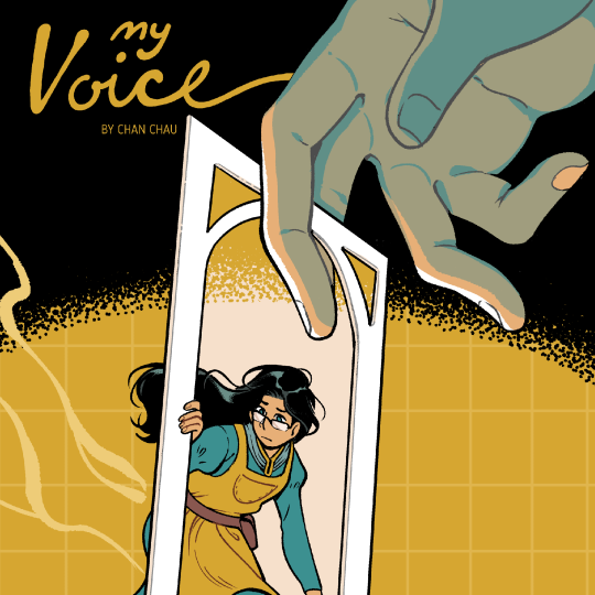
My Voice [New Comic]

Hi folks!

It’s here! My new short comic. My Voice.

If you read my previous blog post, this comic was made for Shortbox Comics Fair! It’s a digital only fair where you can buy a bunch of NEW comics by 100 artists.

I had set this comic as Pay What You Want, but due to time constraints, the person running the fair could not figure out how to get Squarespace to allow for tiered pay. Because of those issues, I’ve asked them to set it to be available for FREE!

You can either download the comic directly from the fair, or on my blog, which I’ll have a link at the bottom of this post. That or you can go to the downloadables page.


I was sort of expecting this comic to breeze by folks, but it was nice to see people react to it. I have such a difficult job finding any value in my voice, because my peers have such incredible ideas, art, and simply excel at everything!!! I honestly don’t know what I can say that hasn’t been said before, if not better. This comic is just a peek into what my friends have to tell me every day!

I hope you all enjoy it! New updates to come!

Download it at Shortbox Comics Fair!

or

How I tone my comics - It's complicated!

Hi folks!

Today, I’m going to cover how I generally do Black and White toning in my comics.

When I was participating in an Original Character Tournament ( abbreviated as OCT ), I had created a quick guide on how I process my tones. It was something to help folks get into comics, but it wasn’t a very comprehensive guide that covered the logic behind my choices. I wasn’t very happy with it, so it has now become this relic that people pass around between friends.

I finally set aside some time to edit this thing, hopefully it looks okay!

The logic between the steps are mostly for printing purposes. In printing, there’s a certain point where a printing past a specific darkness or lightness will end up being black or white. I’ve found that anything under 10% black and over 70% black makes negligible differences on how the printer sees those tones.

When I work, I always think of my art as a product to be printed, even if I don’t. But this kind of thinking gives me a safety net in case I decide to print it, and it allows me to imagine how my comics might look on different monitors. Because every screen is so different, someone with a cheaper monitor might not get to see the full range of tones and hues as other folks, and might make my work look dark or muddy. This is a small prevention measure for myself.

That’s cool, but how do I use this?

If you’re not worried about printing, you could just potentially just use the eyedropper on the provided tones. It will give you a direction on how you should tone your comics by limiting how many steps you get. I do this for a lot of my doodles, because I know I’m not printing it and am simply practicing.

Okay, but I am worried about printing my zine/comic. How should I go about this.

If you’re an indie artist, then even if you don’t prepress your comic entirely correctly, most printers nowadays can handle it. ( Sorry to all my printmaker friends…this is my big opinion. )

It’s not ideal for your quality, but it will get the job done and most readers don’t notice there’s any issues with the comic ( unless it’s too dark, but hopefully this guide will prevent that 😉 ).

Let’s revisit this part of the image, shall we?

Before you tone, you can make separate layers with different percentages. That’s why the numbers are on the guide! It’s the opacity! Doing it this way gives you faster editability, and if you hire a prepress person to touch your files in the future, you’ll make their lives easier.

There’s some more steps to ensure the quality of the print, but maybe a topic for another time…


While I am not an expert at printing or prepress, this book from Iron Circus is an excellent resource for those who want to know how intense book production is. You can learn a lot about how to think in terms of print and taking control over your quality!

I have provided a sample page from my comic SOFTLEAD. I had printing in mind while working on it, and thus I created layers with the techniques I explained in this post!

Clip Studio Paint - How to make a comic page? [Bleed, Trim, Margins, Safe Are

Hi folks!

TO START THIS OFF, THIS IS A VERY OUTDATED TEMPLATE. If you use this template, it will be up to you to adjust it accordingly. Prepress gurus, look away!

CSP has different terminology for setting up their pages, and while some people do not bother putting in all the measurements for their comic pages, I heavily rely on certain features that make my comic making faster. So the set up portion is very important. Regardless if a client provides me a template, I take the time to match the template numbers while making a new project (along with a little trial and error).

So I want to create a quick overview of what certain things mean when creating a new comic page.

I will be using my 8.5 x 5.5” custom template as the example.

Canvas

  • Width and Height here is the entire page size.

  • So imagine if this is your 11x17 piece of paper that you will start marking down the measurements on.

  • I stick to around 450-600 dpi for my comics.

Binding (Finish) Size

  • This is what people consider the trim. This is what the final size of the book (when completed) will be.

  • You can add the bleed in the Bleed section as well! GREAT! However, it only does two digit decimals. Not great. I advise folks who do a 0.125” bleed to round up to .13”

Default Border (Inner) Size

  • This is what people typically call the safe area.

  • Each publicist will have their own idea of margins and safe areas, because every printer operates differently! So if you take your files to one printer, and then to the next, they might have completely different needs. It’s very annoying and very scary, but it’s just how it is!

  • Offsetting X and Y comes in handy because you can make space for the gutter, which CSP will automatically consider when you work in Storymode (an EX feature).


And that’s the basics!

A lot of this wont make sense until you try it out yourself. For good practice, look up a basic comics template and try inputting measurements and tinkering with it yourself.

In my member’s downloads, I’ve also included my very very in “Work In Progress” 8.5 x 5.5” Zine Template. I’ve never released this one to the public because it still has some issues I hope to resolve in the future (example: printing can sometimes result in the art being too close to the gutter, or when importing to inDesign, I can lose some detail along the edges). Overall, I’m confident that if you stay WITHIN the safe area, your printing will work out fine. I can’t guarantee anything though, and ALWAYS consult with your printer.

If you can, please use it with caution as it is not a bullet proof template. So please resist the urge to share this one!


If you have any questions about the template, let me know! Have fun making comics!