Hi folks!
Got a lovely question from the last blog post and have been ruminating on it for quite a long time.
A reader asked how I go about designing merch! So I’ll break the general process down from pins to purses. This process won’t work for everyone because it requires a lot of spatial awareness and being able to imagine objects in space, which not everyone has that ability! There ARE ways to capture the feeling of imagining your project in your hands, but it requires more steps like measuring or finding objects with a similar likeness.
What do I want to make? How do I know if it’s possible?
I put the two questions together because sometimes I don’t know what I want to make! And at times, I don’t know if something is possible until I see it being done by someone else.
A lot of folks use Pinterest, which works! I think the wariness that I’ve faced in my own experience is that making boards and looking at a lot of similar projects makes me more susceptible to taking ideas from other artists, and I have immense anxiety about plagiarism by proxy (my own phrase for spending time intaking a lot of work, but forgetting what you were inspired by and potentially copying something you had just seen in the past, and then someone online will cancel you).
So, how do I use Pinterest to get ideas? While I’m not anyone’s coach or any kind of authority figure at all, I found it really useful to see what manufacturing techniques are possible and work on a design that encompasses how excellent that technique is.
Here is an example of what I’m talking about:
I thought this pin had a lot of great techniques! Soft enamel means it is known to have the color sink in, and the metal sits above the color, which gives it a texture. While hard Enamel means the color of the piece is flat and flush with the metal. Knowing this, you can see and imagine the silver metal ridges of the vinyl will be raised! It’ll have such a stunning hand feel. Alongside that, you can see that on the right side, the record player, not all of the tiny details are filled with enamel. It’s just recessed metal! It helps add depth to the space but does not detract from the overall shiny silver look of the piece, which is very strategic and appealing. The more tiny spots the manufacturer has to fill, the more potential there is for mistakes since colors are manually filled by humans!
It’s a good example of how I wanted to build my own enamel pin that was purely metal, no enamel:
This piece is one inch, which would be extremely hard to fill at its size. It was worth just playing around with the metal to make the tiny details stand out. I thought of how cool challenge coins look, and they also use very similar techniques. The antiquing is the finish so the recessed spaces would look darker, and make sure the raised edges were popping.
Another place to get inspiration is by literally going to stores! I tend to go to places like Hot Topic, Box Lunch, anime stores, Target/Walmart, DAISO, and any place that sells blind boxes. While these goods are made by artists and designers, they’re made for corporations, so their work is already influenced by boutiques, other indie artists, and what marketing deems acceptable. With that in mind, it can give you an idea of what’s selling in the market, and if you’re savvy, you can gleam at what is to come!
At times, even with loads of experience, it’s hard to imagine what a product will look or feel like without seeing it in person. So, I recently went to a Box Lunch to take a closer look at this Howl’s Moving Castle purse.
From the promotional images, you can see it looks like it’s printed on the front, but weirdly enough… Howl and Sophie are actually debossed?! (When a design is basically indented/pushed in.) It was such a weird choice when everything else on the purse was printed, though it was cool to see how thin they got the lines on PU leather. They also have nice rounded studded bottoms that weren’t shown in the sample images. There was a lot to appreciate, especially the puffy nature of the purse to give it that authentic quilted feel.
how to translate your art into merch
This is a herculean task to break down since I had to take a whole semester course just to set good practices for this kind of work!
Here are some tips I can give, though:
Find something equivalent in product AND in size
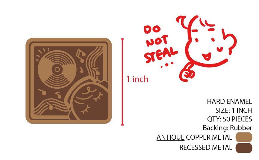
For things like enamel pins and stickers, it’s easy to find stuff that you may have already bought or are on store shelves to reference. Use those objects as a way for you to understand the size and scope of your merch before you commit to the size. Stickers and prints have a little less leeway than enamel pins and purses. Why? With stickers and prints, they’re primarily rasters… so as to avoid pixelization, you have to be sure how to set up your files beforehand to give yourself more mobility. For enamel pins, for example, the manufacturer basically vectorizes your work, and through that, you can dictate the length and size through charts/specs. Here’s an example of my pin, which I do all my vectors and specs myself:
Of course, please do not send this to manufacturers and steal my product. I know this is a given, but just in case.
Even after the manufacturer comes back to you with a proof of your design, you can tell them to change the sizes etc., as that will only effect the cost of the product at that point.
Feel free to use the template above for enamel pin manufacturing. It’s beneficial to them, and it gives you a lot of control over your design.
Make items specifically for the medium… or don’t!
Sometimes I find myself banging my head against a wall coming up with a design to fit a medium. I love to make new designs for stickers and pins etc etc but that doesn’t need to be the case! You can just put an old doodle into the fray or and old drawing and that works just as well.
Obviously, this comes with its hardships, for example, if you have an elaborate illustration it may not be translatable to be a pin. Be practical, of course. But sometimes I forget that I can just put a previously made drawing onto a sticker, and it’s allowed to be a sticker despite not being designed with the expressed intention of being one! Vice versa, if you’re struggling to make your premade work into a product, maybe try making a piece with the product in mind!
Get to know merch terminology.
This is my biggest one. Learning the terms gives me more agency over my product. I can tell what can and can’t be done if I know how things work. Unfortunately, product design is such an ENORMOUS category that terms are somewhat specific to the type of merch you make. However, here’s a small list, from the top of my head, that has lots of overlapping features.
PANTONE COLOR SYSTEMS / PMS - People typically refer to the PMS Color Book as “SOLID COATED.” Most useful when making merch that doesn’t use CMYK printing, such as enamel pins, screen printing, purse making, etc…
Emboss / Deboss or Recessed
Margin / Trim / Bleed - For any printing
Spot Color / Spot UV / Foil
Diecut / Kisscut
MM / CM / IN - Be familiar with both millimeters, centimeters, and inches. Have a measuring tape with both on it if possible.
Finishes - Books: Gloss, matte, semi-gloss, satin Pins: gold, silver, antique, hard, soft, screenprint, dyed
These are just very common words I come across when making merch, and if you’re thinking about making stuff, again, it’s good to get acquainted with it! Searching terms is hard, so using keywords on a search engine such as “common enamel pin product design terms” or “common printing product design terms” can give some results.
If you’re seriously looking to get into fashion or accessories related to clothing, I highly recommend Fashionpedia. It’s been my lifesaver. I own their Bag Design and Textilepedia book as well. It’s the most comprehensive book I’ve ever run across that gives you terms for every piece of clothing!
You will mess up!
I feel like I mess up from time to time. Following my ruleset of “measure twice, cut once” works, but there are times I just mess up. Or the manufacturer messes up, and you just make do with what you have. If something is messed up, run it by your friends or peers to see if it’s sellable. AND take their word for it. Usually, people will say it’s salvageable, buy it, see no mistakes, or take it as a discount. No matter what, most products can be sold or given away. Don’t let it rot in your closet. If you genuinely detest it, give it away to people who give you a nice conversation or as gifts or trades. Make the most out of a mistake! Never let it go to waste!
If there’s any specific product type you’d like me to break down in the future, I’d love to hear from you! This was a general overview, but I am happy to talk about anything in particular. Thanks for reading and your patience this month!


